
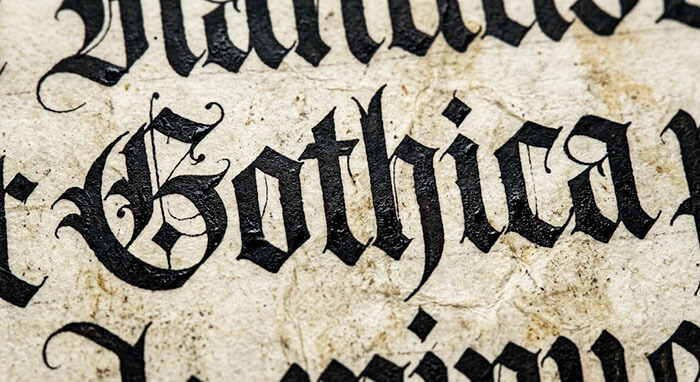
If you look at a document created in 1890, 1950, and 2020, you will notice distinct visual differences long before you read the text. The secret lies in the typography.
Fonts are visual time capsules. Each era in graphic history was defined by specific printing technologies—from hand-carved copperplate engravings and hot-metal typesetting to modern digital vectors.
When creating prop documents, historical replicas, or custom certificates at diplomafiles.com, choosing the correct typeface is the difference between a master-grade reproduction and an obvious amateur attempt. Here is how we match typography to historical eras.
1. The Victorian & Early 20th Century Era (Blackletter & Engravers Scripts)
Documents from the late 1800s to the 1920s leaned heavily into ornate, high-contrast lettering:
-
Blackletter (Gothic): Used for primary headers to convey religious or royal authority.
-
Engravers Roman & Calligraphic Scripts: Used for body text, featuring extreme contrast between thick downstrokes and hairline cross-strokes, mimicking hand-carved steel plates.
2. The Mid-Century Corporate Era (Geometric Serifs & Crisp Layouts)
By the 1950s, institutional design shifted toward clean, authoritative clarity.
-
Classic Serifs (like Garamond and Baskerville): Replaced overly busy decorative fonts, giving certificates a clean, academic look with balanced margins.
-
Centered Grid Balance: Text blocks became highly symmetrical, relying on precise line spacing rather than heavy decorative flourishes.
Victorian Era (1890s)  -> Gothic Blackletter & Heavy Swirls -> Ornate & Complex
Mid-Century (1950s)    -> Balanced Serif Fonts (Baskerville) -> Clean & Academic
Modern Hybrid (2020s)  -> Sharp Vector Sans-Serif / Serifs   -> Minimalist & Crisp
3. The Digital Trap: Avoid “Default System Fonts”
The most common mistake DIY designers make is using standard computer fonts like Times New Roman or Arial for historical recreations. Modern system fonts lack the subtle weight variances, authentic ligatures, and hand-carved nuances of true historical typefaces.
At DiplomaFiles, our design library features thousands of commercially licensed, era-accurate typefaces. We carefully match every character, drop-cap, and flourishing script to ensure your custom document looks completely period-correct.
👉 Demand Absolute Accuracy. Start Your Custom Project at DiplomaFiles.com!