
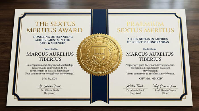
In our globally connected world, academic degrees, international charters, and professional certifications are frequently issued in bilingual or multilingual formats.
Whether pairing English with Latin, Spanish, French, or Mandarin, displaying two complete translations on a single physical page poses a serious graphic design challenge.
If designed poorly, a dual-language document feels crowded, hard to read, and aesthetically chaotic. At diplomafiles.com, we use structured grid systems to achieve balanced bilingual elegance. Here is how to organize dual-language layouts seamlessly.
1. The Three Master Layout Grids for Dual Languages
Depending on the length of your text and the formal traditions of your institution, choose one of these three proven grid models:
Model A: The Parallel Column Grid (Left / Right)
Splits the main text body into two equal vertical columns. Ideal for documents with equivalent text lengths (e.g., English on the left, Spanish on the right).
Model B: The Interleaved Sub-Text Grid (Top / Bottom)
Features the primary language in a bold, prominent serif font, followed immediately by a smaller, italicized translation line underneath.
Model C: The Mirror Page Spread (Front / Back or Facing Pages)
Keeps the primary language on the front face of the archival cotton sheet, placing the official secondary translation endorsement on the reverse side.
┌────────────────────────────────────────────────────────────────────────┐
│                        PARALLEL COLUMN GRID LAYOUT                     │
├───────────────────────────────────┬────────────────────────────────────┤
│         ENGLISH SECTION           │          LATIN SECTION             │
│   "Be it known that John Doe      │   "Notum sit omnibus John Doe      │
│   has fulfilled all requirements" │   omnibus causis satisfecisse"     │
└───────────────────────────────────┴────────────────────────────────────┘
2. Font Hierarchy in Dual-Language Systems
To avoid visual competition between two languages, assign distinct typographic roles:
-
Primary Language: Standard weight, dark charcoal tone, primary serif font.
-
Secondary Language: Slightly smaller point size, lighter font weight or subtle italics, ensuring the reader’s eye naturally prioritizes the core text.
Global Design for International Achievements
Ensure your international credentials look authoritative in every language. Explore bilingual layout templates at diplomafiles.com today.