
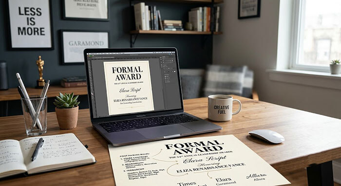
When designing a formal certificate or institutional charter, typography carries all the structural weight. However, one of the most common mistakes in amateur document design is using too many competing font styles.
If every title, name, and date is written in an ornate, loopy script font, the document becomes practically unreadable. On the other hand, using only plain computer fonts makes an award feel cold and overly administrative.
At diplomafiles.com, we rely on strict visual hierarchy rules to blend script calligraphic accents with clean serif authority. Here is how to balance typography like a master designer.
1. The Anchor & Accent Rule
A successful credential layout should clearly guide the reader’s eye through a structural flow: Who issued it ➔ Who received it ➔ What was achieved.
-
Serif Fonts (The Authority Anchor): Use clean, classic serif fonts (such as Garamond, Bodoni, or Caslon) for institutional names, legal disclaimers, and body text. Serifs provide structure, stability, and high readability.
-
Script Fonts (The Personal Accent): Reserve calligraphic script fonts for personal names or high-level honor titles (e.g., Doctor of Philosophy or Award of Distinction).
[ Top Header ]     ──> Clean Serif / All-Caps (Institutional Anchor)
[ Recipient Name ] ──> Flourished Script / Calligraphy (Personal Focal Point)
[ Body Text ]      ──> Classic Serif (Maximum Legibility)
2. Managing Font Weight and Letter Spacing
To maintain clean contrast, pair light calligraphic swashes with all-caps serif sub-titles that feature extra tracking (letter spacing).
Amateur Layout  ──> All Calligraphy Script  ──> Overwhelming & Hard to Read
Master Layout   ──> Serif Anchor + Script Accent ──> Perfectly Balanced Visual Hierarchy
Master the Art of Typography
Don’t let poor font choices ruin a major milestone. Explore our expertly curated design templates at diplomafiles.com to ensure your custom creations radiate balanced authority.