
The Psychology of Paper Texture: Why Tactile Quality Drives Brand Trust

In an era where we swipe past thousands of smooth glass screens every day, our sense of touch has become starved for real, physical contrast. When someone hands you a physical document, your brain makes a judgment about its value before your eyes even finish reading the headline. This subconscious reaction is driven by haptic […]
From Screen to Paper: Why Colors Look Different in Print Than on Your Monitor
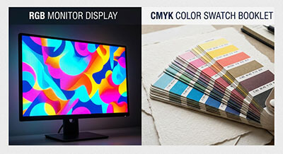
Have you ever designed a digital file on your computer, picked out what looked like a bright gold or deep navy blue border, sent it to a printer, and received a print that looked dull, muddy, or completely different? This is one of the most common frustrations in graphic design. The reason behind this mismatch […]